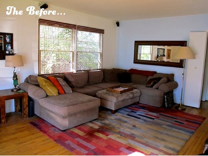
After living in this cozy, pieced-together space for six years, my husband Matt and I decided we could use a change of scenery. Not in the form of a new house, but in a newly decorated living room. Thus, the “Before” was born! To see the “After” click in to our “Living Space Makeover Finale!”
Actually, how all this came about was that my father passed away last summer and to our surprise, endowed us enough money to pay off some bills and the opportunity to recreate our home’s main hang-out area. I hadn’t known my father for many, many years and wasn’t sure I wanted to keep this inheritance in the form of a physical daily reminder. However, with much reflection, I believe that God took him and all the “bad stuff”, and left behind “the love”. Yes, this new room in our home is now full of love.
The “Before”: What was I thinking?
So, now that our rarely-touched savings account had this cache of cash, I was ready to begin thinking my way through the process of decorating a new ideal space. In my head, I wanted to gut the place, and I quite nearly did. I knew this was a fairly big task, but using my “design force” (that something we all have-an inner decor voice telling us what feels right in the form of color, style, vibe, etc.), I was up to the challenge. Here is a run-down of what we wanted to change:
1. The overall hang-out area: mainly the sofa was beginning to look and feel a bit droopy. We bought the sectional above at Jennifer’s Convertibles, (note: I would swerve clear of this store…their showroom presents one thing, the delivery guys drop off something altogether cheap). Within a year, the cushions (stuffed only with synthetic filler) lost most of their shape and form and the throw pillows…well, yeah, I wanted to throw them out! The ultra-suede ottoman was also showing signs of aging (and plenty of stains and paw prints to boot). Finally, the wall mirror was completely off center (Wha? How did that happen?!) and the rest of the accessories were from Matt’s bachelor days, not at all updated or representative of “us”. Theys gotsta go!
2. The entertainment area: seriously, looking at this photo…need I say more? Okay, okay. Well, this 2004 Ikea three-piece cabinet and book shelves unit screamed “outdated!” for one, the size of it also swallowed up both the energy and the precious real estate of this room. Save for a few square inches, this wall was just brown, brown, brooooown. The sad paintings tried to infuse a little colorful cheer, yet, alas, they too were surrounded by brown. Oh, and Mr. club chair…well, he’s just laughing now.
3. The “entryway”: uh, yeah, if you can call it that. Clearly, the scale of the mirror with shelf and key hooks were being dwarfed by a very large, vanilla-blah wall. It was also a perfect place to collect “car clutter”. The sad little corner was often crowded by reusable grocery bags, umbrellas and “Klunk” (dust and fur) bunnies, while the bench played “squeeze-the-lemon” with the side table and sectional. Not at all a welcoming “hello”.
4. The empty dining room: this part of the room was my favorite. Aside from the no-longer-our-style chandelier, the oversized, bachelor left-over King Kong print, and an unfinished ski cabin style cabinet, I really liked the light that poured in from these nearly floor to ceiling windows. Unfortunately, they have been painted over so many times, they no longer open.
And le piece de resistance…
…lovely. This is Klunkers’ only vise and bad habit: clawing at the window sill and frame and breaking through the window (a count of three times now), sending solicitors and postal carriers running screaming down the street. Thus, rewarding this behavior a-gain!
The Beginning of the “After”: the color inspiration…
So, it was December when I finally mustered up the courage to take the first step towards this redecoration. I wanted to start with a doable and inexpensive project: a hand-knitted throw. My mom and I took a short trip to Michaels and I allowed the “Design Force” to flow through me. It was as if Obi-Wan was by my side as I began pulling colorful skeins of yarn and gently placing them into my hand basket. “Skaie, use the force…” I turned off my inner computer and felt my way through. What do you think?
The Source List: could I stay within budget?
I started with $4,600, and with the sale of the sectional (a respectable $350), the end total budget was $4,950. That number would possibly change, as we still had some other accessories and furniture to sell. Still, I took that number and began writing the “wish list” below, sending Matt reeling with thoughts of “What are you thinking?!?” Actually, he held his breath and trusted I would shop efficiently, as I have these past seven years (coupons are like cash!). Here are the actual scribbled notes I held strong to along the way:
I was excited, but in unfamiliar territory. For the first time in my life, I actually had a budget. Would I make the right design decisions? Would I stay within budget? Would I have the endurance to go the renovation distance? After all, I’m no professional designer. I’ve never taken a class or had any kind of formal training. Still, I have restyled my home office and Matt and I did do a McGuyver-esque curb appeal makeover, so, ya never know. I could pull this off. Stay tuned to see how it all unfolds (crossing fingers it won’t unravel!).
What do you think about this “before”? Do you have any suggestions on how you might re-design this space?
All photography by Skaie Knox, HomeJelly
