Entrance.
I’m not sure if I’ve mentioned this before, but, aside from ice hockey and snow skiing, house hunting (better known as “looking-looing”) is one of our family’s favorite sports. Okay, so, it’s not really a sport, but doesn’t walking up and down stairs, opening and closing doors and signing the realtor’s guest book constitute as some form of exercise?
Well, on a recent “workout” we entered a home that might have looked staged at first glance, but as we strolled from room to room, it felt as if we were really walking through a well designed home-home. As we eventually stumbled into the office space, and with the cunning of an expert snoop, I eyed a framed diploma confirming my suspicions: the owner was a designer.
So, with iPhone at the ready, I surreptitiously snapped off these photos (and did so for our HomeJellies!) that demonstrate how a designer designs a California home.
The Entrance (top photo): immediately upon entering, we were welcomed by the archways, both in the door and the formal living room windows. Area rugs warmed the space as well as the cheerful green wall color and the mimicking wood tones of the built-in book cases. If you take a second look, you’ll see additional repeated patterns of an arched semi-circle in the iron work in the door as well as the light sconces and wine rack.
Stair Doggie: seemingly the watcher of the stairs, this iron doggie gives us a hint that his owners have a love of dogs and/or a sense of fun when it comes to design.
Water pitcher and sewing table: at the top of the stairs sat this antique sewing machine and pitcher; a perfect piece to bring decor meaning to this nook and add character and interest.
Reading Corner: one of the first bedrooms contained this very comfy chair and ottoman, a perfect space for snuggling up to a good book. I loved the eclectic and easy mix of *tossed pillows and Afghan throw. (*See! I told you they were dog lovers!)
Red Bedroom: the choice of this particular shade of red in this room, along with the mixed textiles of the bed linens shows an expert’s finesse. Additionally, the understated, yet tastefully placed picture frames next to the window give the room a relaxed and uncluttered air.
Book Bench: instead of leaving the hallway bare, or designating the walls as an obvious family gallery, this designer created a mini library by placing a quiet bench with stacked books and curios. Lovely.
Hallway nook: we’ve seen them in new builds before, those little architectural nooks that often leave us decor civilians scratching our heads as to what to do with them. There’s no matchy-matchy decorating going on here, just an honest and tasteful display of practical meets beautiful.
Iron Bed Frame: the common decor thread in this home is comfortable, real living. I stayed in a bed very similar to this one at my grandmother’s farmhouse. It smacks of timeless, yet old world charm and summons the pleasure of visitors’ company.
Bathroom accents: leaving no stone (or, in this case, loofah) unturned, the bathroom is dressed with lovely and practical accessories. That’s the beauty of this home’s decor: the accents and furniture pieces are useable and actually make sense in each space. Examining this Asian inspired room more closely, we see how the beautiful bamboo boxes can hold soaps, oils, scrubs and hand towels. The incense bowl is for aromatherapy, and, while the bath is empty, an orchid keeps it company. I’m certainly taking a page.
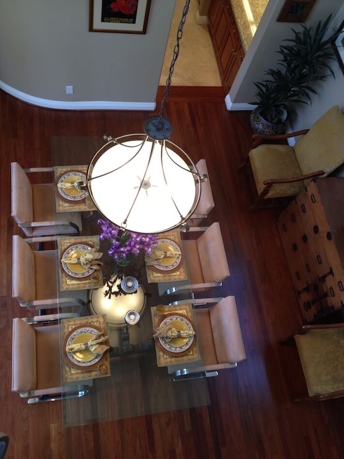
Dining room: with an open concept and visually accessible from upstairs, this dining room’s clear glass table top allows the furniture and dishware to be showcased. The light fixture even shines in its own reflection.
Photography by Skaie Knox, HomeJelly.com
